Monday, November 25, 2013

The Color of Brown

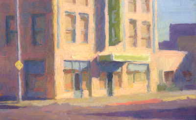
Last week I posted a plein air painting I did of this building in Phoenix. I wasn't overly happy with it but I felt there was potential. Here is a second version that I did in the studio. I cropped in closer and gave more thought to the color of the building. I like the compression of space that happens when you paint a small part of a distant view.


Here is last weeks version.

Friday, November 22, 2013

Backlighting = Shapes

A small study based on a photo in Phoenix. As I've mentioned before, backlighting often provides strong / dark light patterns and shapes to work with.

Tuesday, November 19, 2013

To Paint…or not…

This is an older apartment building that has intrigued me for years. It is nothing fancy, just a solid building from…the 40's? I've often thought about painting it but never quite got the final click in my head that there was something worth spending a few hours on. Last week I went into Phoenix to paint, after driving around for over an hour, I decided to give this place a shot. I think there are some possibilities here I want to further explore. 8x10 on canvas mounted to board.


Mesa Churches


Wednesday, November 13, 2013

Practice, Practice …


This past weekend I participated in the quickdraw in Scottsdale's Fall For The Arts Festival. Main street was blocked off and 30 artists filled the street, each creating a piece of art in 2 hours. I wanted to paint this theater from a photo and sketches I had done over in LA earlier this year. I knew it would be a little ambitious to finish a painting this involved so I did a practice version a few days before the event. Sure enough, it took me 4 hours to complete the painting. I did it again and got it down to a little over 3 hours. After 4 more repeated paintings (so 6! altogether), I was able to get it down to 2 hours. Painting the same painting 6 times in a row may not sound very creative, however, I found it to be instructive. It taught me how to better simplify and economize - making every stroke count. When I did the painting on Saturday, I finished in time, not by feverishly throwing paint around, but by making decisions (both rationally and intuitively) about every color I mixed and every stroke I made. It turned out rather well. 
This version is the 6th practice piece.

Thursday, October 31, 2013

Monday, October 14, 2013

House in Mesa

Another painting of a bungalow style house, this time in Mesa. Plein aire, 6x8.


Wednesday, October 2, 2013

Fast food

This KFC gave me a chance to work with some interesting shapes and thick paint. Painted this past Monday morning, 6x8.


Monday, September 30, 2013

Backlit San Francisco

Another study (8x10) based on a photo I took in San Francisco a few years ago. I like painting subjects that are backlit. It simplifies the shapes and creates wonderful atmospheric perspective.


Saturday, September 28, 2013

Intensity/neutrality

This is a little 6x8 painting based on a photo I took a few years ago in San Francisco. Aside from the point of view and the interesting shapes of darks and lights, I was interested in the neutrality of most of the color with just a few accents of intensity.


Tuesday, September 24, 2013

Painted a canal this AM

Got out and painted a canal this morning. Weather's cooling down so we can do this now. Bright sun glaring off water and the new paved bike path. I was mostly concerned about getting a color idea down and an interesting composition.

(shot on site: a little out of focus and some weird reflections that look like pixie dust)

Saturday, September 14, 2013

Wednesday, September 11, 2013

Harvest Moon over New York

My friend Brad Teare, art director at the Friend magazine (he's also an accomplished painter with a good blog) asked me to do a cover for their October issue. He said they wanted something that looked a little more urban than their usual pastoral settings. Also, that I might include something about the season.


The Friend is a publication of the Church of Jesus Christ of Latter-day Saints (of which I am a member). For their covers, they assign an illustrator a month and let him or her come up with five or so ideas and they choose which one they want. It's not real often that I get that kind latitude. Thanks Brad!

Here is one of the reference photos I took of my grandkids.


Monday, September 9, 2013

Parched. A book cover

Claire Counihan, AD at Holiday House, asked me to do a cover. It's a book called Parched. The world has gone through decades of drought and is dried up, except for a domed city built by some of the surviving people. It has it's own biospher. This is the work in progress.


Monday, September 2, 2013

Superstition Sunrise

Between illustration jobs and teaching, I haven't had much time to paint. So I've started doing quick half our sketches of the sunrise looking east from my neighborhood. 


Monday, July 8, 2013

Circles Records and Tapes

One of the cooler buildings in downtown Phoenix is Circles Records and Tapes. It was originally a Studebaker showroom, built back in the forties. Inside the round glass front was a turntable floor that would go round and round with cars on it, showing them off to the passing public. A good example of streamline deco design, of which there is not much in the valley. Sometime in the seventies, it became a record store. Unfortunately, with the changes in the music industry, Circles finally closed in 2010. The building is still there but is threatened by the fact that the owners have not registered it as an historic building. You can read more about it at Modern Phoenix. This is a small color sketch I did from a photo I took a couple years ago.


Thursday, June 13, 2013

New England Landscapes.

I'm currently working on a piece for Yankee Magazine. Lori Pedrick, the art director, calls me about once a year to illustrate what is usually a wonderfully written personal essay about New England and the author's connection to some aspect of the landscape. The current one is about mending a fence.
This is the piece, about 75% done.


The first piece that Lori commissioned from me was for an article "A Fierce Yellow Light". The author told of her affection for the maligned Norwegian Maple.


Finally, this  landscape was for a description of the end of Autumn and the "coming of another kind of beauty".


Thank you to Lori and Yankee for good assignments. I'll post more of my Yankee paintings later.

Sunday, June 9, 2013

Friend Saves the Day

Some years ago, the night before a head painting workshop I was holding in my studio, the model emailed and said she could not come. After a few minutes of vengeful thoughts, I called the daughter of a family friend who I had wanted to paint for some time. She said she would be happy to model. She was only 17, had never modeled and did a superb job. I called her back a week later and shot some photos, one of which is the basis for this study. 

Gouache with pastel

Tuesday, June 4, 2013

New Windsor Hotel, An Old Friend

I found the New Windsor Hotel shortly after I moved to Arizona in 1982. It's been the subject of quite a few of my paintings over the years.

The first in the mid 80's.


Shortly after that I became busy with other kinds of art work and didn't do much city painting until the 2000's. This was the next version.


Shortly after that, the building was painted a brighter pink color. However, I subdued the pinkishness in this little version here.


Finally, I recently painted this study. It's different from the others in that I worked from the west facing facade as opposed to the front. The late afternoon summer sun is as much the subject as is the building.


The New Windsor has been a good old friend. 

Monday, May 6, 2013

Taco Stand


This used to be a hamburger stand here in Mesa. Over the past couple of decades, good cooks from Mexico have taken over many of these old fast food places so now instead of marginal cheap hamburgers, we have an array of tasty Mexican Cuisine. I went out this morning and painted this sketch of one that I have wanted to paint for years. I’m thinking it may be the beginning of a series.


Tuesday, April 9, 2013

Yellow

I find I paint a lot of yellow things. I should probably write about that sometime. For now, here is a little sketch I did from a photo I took in San Francisco a few years ago.


Sunday, March 3, 2013

Phoenix Bungalow

Here's another quick painting for my city class. This is one of the wonderful houses around 7th Avenue, a little north of the freeway.


Monday, February 25, 2013

Painting In The City Class

This past Saturday was the first day of painting in the city with my new class.


I had them start out with a 4 value study like this.


We'll work on the color this week in the studio. This is a study I did on Friday prior to the class.


Tuesday, February 19, 2013

Sunlight On A Wall

I had a new class begin this past Saturday, Painting In The City. So Friday I went out to do a quick little warm-up for the class. Not far from my home is this recently built house (still no landscaping) that is beautifully designed in an Italianate style. I'm generally not fond of such houses because they often miss the mark. Usually they are much too bombastic looking, tending to be more of a 1970's Faux Italian Miami look. But this house got it right. The proportions and perfect. Every time I drive by I think I need to paint it. My little version here, 6 x 8, reminds me of Edward Hopper's statement: "All I ever wanted to do was paint sunlight on a wall".


Monday, February 11, 2013

Homage to the Flu

Last week I came down with the worst sickness I've had in years.


Clouds

I've not been getting out to paint much lately but the clouds this weekend beckoned me for a quick sketch.


To see some other paintings of clouds from this weekend, look at my friend Martin's paintings.

Sunday, January 27, 2013

What do you draw


What Do You Draw?

What subject matter inspires one to draw? I gave my drawing class a sketchbook assignment to draw any 5 things outside their house. One of the students got confused and thought she was to draw 25 things. She emailed me saying there aren’t that many things to draw! I replied saying that there are at least 125 things close by her house to draw but that she only had to do 5. She said, well, yes, but I don’t really want to draw any of them. With that in mind, I went outside to see what I would draw. The first thing I came across was the ditch where my brother-in-law had repaired a leaky pipe in our sprinkler system. Was I inspired? No, but as I drew I found the maze of pipes and valves and the sides of the ditch interesting and challenging to draw. It’s a quick sketch but I hope it demonstrates that if you just start drawing, you can find interest.


Friday, January 25, 2013

Line vs Tone…or…Line + Tone

The advanced drawing students I've been working with have been taught the value of tone and have learned the lesson well. I am now trying to encourage them to explore line more fully. A common misconception is that tone is the only way to create volume and mass. Tone certainly helps but the line drawing itself, when understood and used well can do much of the work. To illustrate, I did this demo for my class.


This final version shows the integration of line and tone that I tend to like in a drawing. Here is a wonderful example of what I'm talking about, a drawing by Jerome Witkin.


Sunday, January 20, 2013

Ramses

Last year I worked on a few pieces for my illustration portfolio.This was the most successful. I went back to an old style I used to work with - pastel over gouache.


I did some other preliminary sketches, this being one that I would like to pursue sometime.


Wednesday, January 16, 2013

Monday, January 14, 2013

Head Study

Just a partially done painting of Danielle, a family friend with a great face to paint.